mNo edit summary Tags: Visual edit apiedit |
Tag: sourceedit |
||
| Line 7: | Line 7: | ||
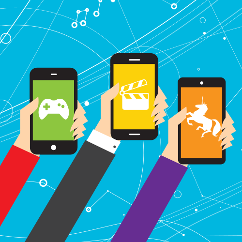
More than half of all visitors on FANDOM come from a mobile device, such as a smartphone or tablet. While the number of desktop users has stayed roughly the same in the past few years, the number of mobile users has been steadily growing. In January 2015, their numbers surpassed our desktop users for the first time - and we expect the number of mobile users to keep growing. |
More than half of all visitors on FANDOM come from a mobile device, such as a smartphone or tablet. While the number of desktop users has stayed roughly the same in the past few years, the number of mobile users has been steadily growing. In January 2015, their numbers surpassed our desktop users for the first time - and we expect the number of mobile users to keep growing. |
||
| − | [[File:Mobile_growth_desktop_stagnation.jpg|Comparison desktop vs. mobile use|center|500px]] |
||
Many pages on FANDOM look perfect on desktop, but are very frustrating to read on mobile. We want to make sure they have the best possible user experience when they are looking at your pages, no matter what devices they're using. |
Many pages on FANDOM look perfect on desktop, but are very frustrating to read on mobile. We want to make sure they have the best possible user experience when they are looking at your pages, no matter what devices they're using. |
||
Revision as of 23:47, 14 June 2017
What makes content portable?
Content is portable when it adapts to every screen - no matter its size or orientation. Whether you're looking at a page on your large desktop screen or scrolling down vertically on your small smartphone, the page should always be easy to read. To make that possible, images and page elements can move underneath or above text instead of sticking next to it, navigation bars may turn into dropdown menus, and some fun special effects may disappear on mobile, so your phone has no problems loading the page.
Why is this so important?
More than half of all visitors on FANDOM come from a mobile device, such as a smartphone or tablet. While the number of desktop users has stayed roughly the same in the past few years, the number of mobile users has been steadily growing. In January 2015, their numbers surpassed our desktop users for the first time - and we expect the number of mobile users to keep growing.
Many pages on FANDOM look perfect on desktop, but are very frustrating to read on mobile. We want to make sure they have the best possible user experience when they are looking at your pages, no matter what devices they're using.